Demo: Image Transformation
Description
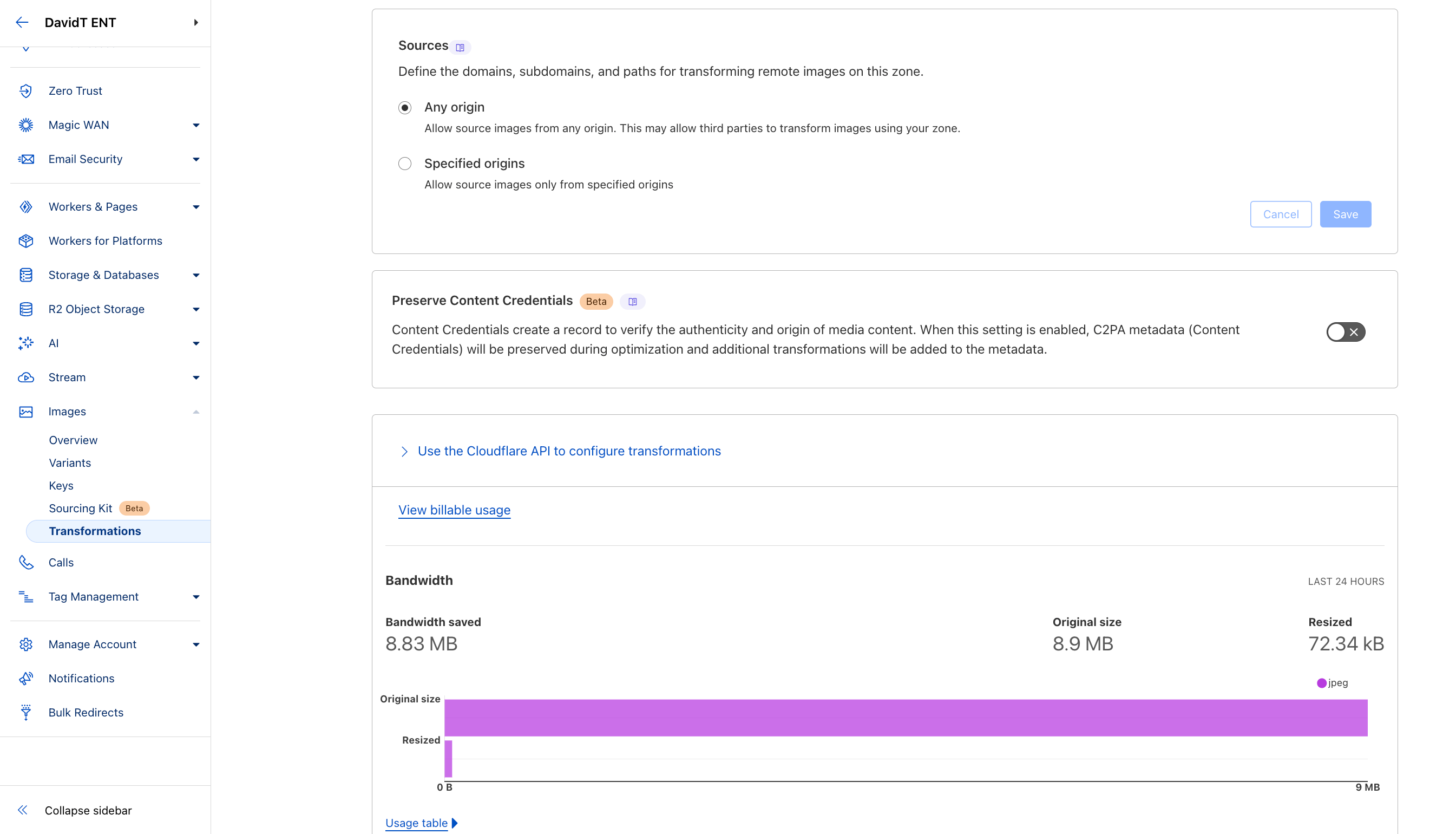
There are three main methods to transform images:
-
via URL
- usually also used with
srcset - via Workers
- via Images Binding to Workers
The Workers method allows for more programmatic customization, as well as more complex transformations, such as drawing overlays and watermarks.
The URL method is simpler to implement, such as using
width=auto to
automatically resize the image based on the available browser and
device information. Optimize images for mobile devices by using
lazy loading or eager loading.
Each of these three methods assumes the original images are hosted on an external origin server (e.g., Amazon S3) or in Cloudflare R2.
Alternatively, if you're looking for a managed service with built-in image hosting capabilities, consider using Cloudflare Images.
Last Updated: April 2025
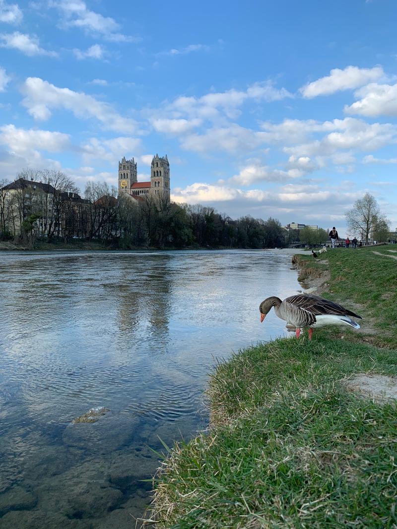
Image Transformation via URL Demo
Original Image with characteristics: 3 MB in size, 2419w x 3226h px, 72 resolution.
Transform URL:
Lazy Loading Demo
Images below only load when they come into view:
Responsive Images Demo
This image automatically adjusts its size based on the viewport width:
How it works:
-
The
loading="lazy"attribute defers loading images until they enter the viewport -
The
srcsetattribute provides multiple image sizes for different viewport widths -
The
sizesattribute tells the browser what image size to use at different viewport widths - Cloudflare automatically generates the correctly sized images on-the-fly
Image Transformation Settings